An A-Z Guide About Colours in UI Design
23/12/2023 2024-08-07 13:25An A-Z Guide About Colours in UI Design
Colours are integral to designing. It conveys the brand personality, adds gravitas to a website and attracts the eye. UI designers must thoroughly understand how colours in UI design impact consumer decisions which will help create an efficient and engaging interface.
Spoiler alert: wrong colour choices may affect the bottom line of the firm as well! Thus, never underestimate the importance of colours in UI design.
In this article, we will walk through the fundamentals of colour theory for designers, how they affect the customer psyche and mindful ways to choose colours while designing. This way, you can help influence buying behaviour, build positive client relationships, and accurately convey the brand’s messaging.
Are you interested in UI/UX designing? A great way to learn more is through a formal master’s degree, like the one available at JD School of Design, Bangalore! Learn more here.
Importance of Colours In Website/App UI
Colours are as important as words, structuring and layout in a website or app. They influence first impressions and establish the brand’s mood, concept, harmony and connotation. They trigger specific emotional responses that influence purchase decisions. (Ex) Studies show that customers prefer tech companies with blue in their logo or website as the colour conveys security and credibility.
Choosing the correct aesthetic colour combinations also have the following benefits.
- Better readability– Contrasting the colours for text and background promotes better readability.
- Highlights crucial information– Structuring information without any breaks in may put off website visitors. Hence, highlighting important information through colour helps.
- Subconscious branding- What comes to mind when we say red and yellow? For many, it is Mcdonald’s, KFC or Burger King. Thus, appropriate colours can trigger recall among users.
- Increases the strength of elements– Call-To-Action elements like ‘Buy Now’ or ‘Read More’ are generally highlighted with colours like green, red or black. It is because they convey urgency and stimulate intuitive interactions.

Thus, UI designers have to deliberately choose colours to bring out the right emotions. As per AmbitionBox, salaries for UI designers in India range from Rs. 3.1 LPA to 3.67 LPA.
Unravelling Colour Theory in UI Design
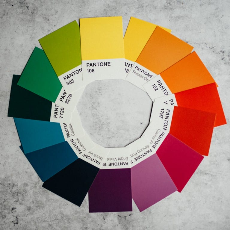
Simply put, colour theory is a system of guidelines that lets designers know the effects of colour mixing and how specific colour combinations appear to the human eye. The colours are generally depicted in a wheel and are divided into three: primary, secondary and tertiary colours.
- Primary- red, yellow and blue.
- Secondary: Mixing of primary colours leads to secondary colours. For example, red and blue form purple.
- Tertiary: When secondary colours blend with primary colours, they form tertiary colours.
In UI designing, you must have a firm grasp of these fundamentals to create meaningful designs.

CSS is a style-sheet markup language used to add colour to a website. UI designers need to be knowledgeable in its use, as it supports two colour coding systems: RGB and HEX.
RGB (Red, Green, Blue)
RGB values are derived using additive colour mixing. The values for the primary colours are written, and the colour formed is a combination of the three values. It ranges from 0-255. For example, if R is 255, G and B are 0, the resulting colour is red. Tweaking these values will result in more colours.
One can also adjust the transparency of the colour by adding another value- A, that ranges from 0-1. So A of 0.5 is half transparency.
HEX
Hexadecimal codes are similar to RGB but use a different way of writing. Here the base is 16, and all colour values are written accordingly. The first digit is multiplied by 16, and the second digit is added to get the colour code.
Fortunately, these values are used widely and are simple to copy-paste.
Expertise in these coding systems is essential to become a successful UI designer. To understand the importance of colour theory, check out this blog.
Colour Psychology in UI Design: What Colours Signify And How To Use Them Optimally
By now, you must be familiar with the idea of influencing human emotions with colours. This process is called colour psychology. It denotes brand personality and values.
Cool colours like blues and purples denote tranquillity and professionalism- suitable for serious service providers. On the other hand, reds and golds boast a fun, quirky and passionate personality, perfect for restaurants, dating apps and social media platforms.
Meanings of other colours include-
- Green- harmony, growth, stability.
- Orange- creativity and enthusiasm.
- White- peace, intelligence and wealth.
- Black- elegance, luxury and power.
- Pink- love, femininity and innocence.
Tips And Tricks To Building A Perfect Colour Palette
While narrowing down a colour palette for UI design, one should reinforce the brand’s unique voice and style. The colours and the branding must not mismatch. While colour psychology plays an important role in choosing these colours, there are two more factors to be considered.
Colour Combination
It’s not ideal to use just one colour for the brand. It is monotonous that may lead to bounces. Principles of colour design suggest 2 or 3 colours to attract maximum attention. But how can one choose their ideal colour combination?
- Monochromatic– This is when all three colours are of the same hue. Use this when you want eye-pleasing designs.
- Complementary– Here, colours on the opposite ends of the wheel are combined. (ex) orange and blue. Use this when you want to incorporate both cool and hot colours.
- Analogous- These colours are next to each other in the colour wheel. (ex) yellow, orange and white. Use this to vary the brightness levels on your interface.
Colour Balance
The colours are picked! Now, all you need to do is decide how to balance them to achieve cohesion. This is where the 60-30-10 rule comes into play.
60% of the colour used is the primary colour. It’s contrasted with 30% usage of the secondary colour, followed by 10% use of the final colour for highlights and accents.
Wrapping Up
Colours in UI design are not just a matter of personal taste but involve thorough deliberation. Choosing the right colours and using them correctly have numerous benefits for business.
To learn more about UI/UX design, you can visit the JD School of Design campus in Bangalore. They offer a master’s course to help you become a great visual artist!
Get, set, and design!


