Colour psychology in design
Colour psychology
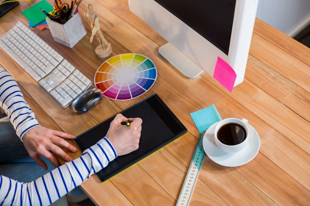
The study of colour psychology concerns how colours affect human emotions, behaviors and how colour psychology in design. How we react to colours is determined by a complex interaction between our tastes, family upbringing, and cultural background, which varies from person to person.
Colour can affect perception subtly; for instance, it can either enhance or detract from how food tastes. They can enhance their effectiveness with the right colours for pills and placebos. Blue is associated with calming or sleep-inducing pills, and red and yellow are usually associated with stimulants.
Brands and businesses deliberately employ colours when they design their products, packaging, advertisements, and websites. To achieve a high level of design, it is important to select colours compatible with both the brand and the company’s mission. A designer’s goal is to use colour psychology to trigger the right responses from consumers, which is one of the objectives of the design.
A great designer anticipates how colours will be perceived based on cultural differences. Colours can have different meanings to different audiences; for example, yellow in most cultures has a bright, cheerful connotation, while in China, it may connote vulgarity or adult meanings. While white symbolizes purity and is often used for bridal branding in the United States, it is also regarded as a symbol of mourning in Japan, India, China, Korea, and the Middle East. It would be best to remember that the bottom line here is to know your audience and make the right choice.
Colours in focus

Let’s take a closer look at each type of colour and the individual colours within it:
Colours that are warm to the eye
The warm colours are the tones of red, orange, and yellow and their tertiary variations. They are generally considered positive, passionate, cheerful, enthusiastic, energetic, and energizing.
Red (the primary colour)
- Positive associations: Sense of passion, strong emotions, excitement, love, confidence, comfort, and warmth.
- Negative associations: Dangers, anger, violence, fire, and warfare.
- Common design uses bright red as an accent colour and dark red with grey and white to create an elegant and professional look.
Orange (secondary)
- Positive associations include excitement, energy, health and vitality, friendliness, enthusiasm, beauty, earthiness, seasonal change, affordability, and warmth.
- No negative associations have been identified.
- Orange is often used on food and drink websites to stimulate appetites.
The yellow colour (primary)
- The word is associated with positive emotions, such as warmth, cheerfulness, attention-grabbing, happiness, and hope.
- There are negative associations with anger, frustration, caution/danger, cowardice, and deceit.
- Yellow is a popular colour used in the design of products and services involving children. Golds and darker yellows are used to achieve an antique look, a feeling of permanence, and long-term appeal.
A cool colour scheme
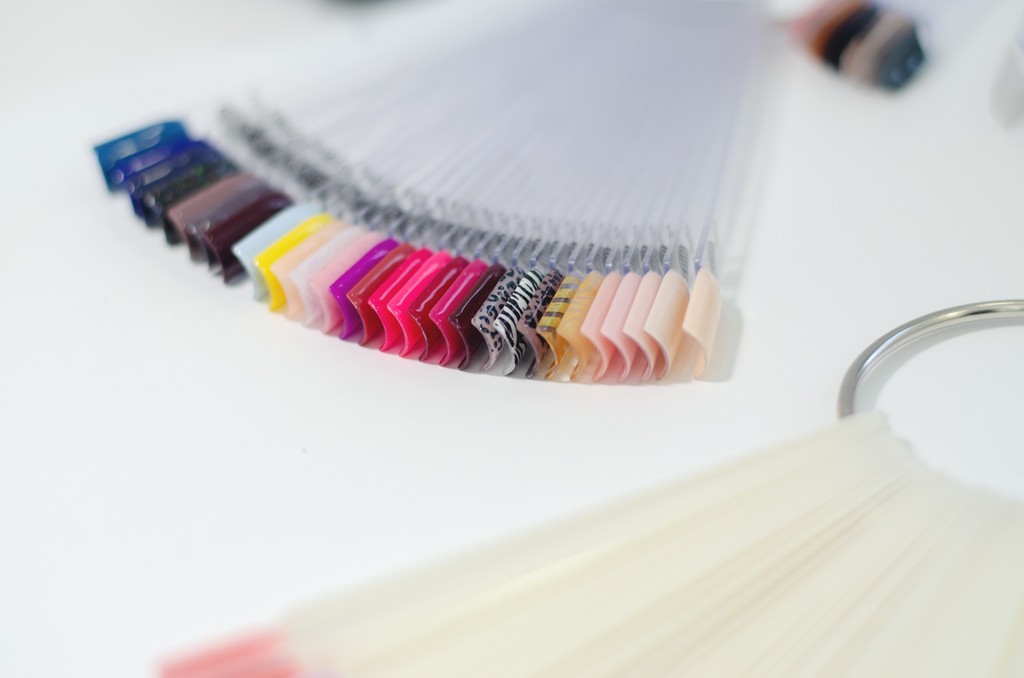
The cool colours are green, blue, and purple, as well as their tertiary variations. They are generally considered more reserved, relaxed, professional, and calming than warm colours.
The green colour (secondary)
- There are positive associations with nature, growth, health, new beginnings, money, renewal, calm, abundance, soothing, fertility, good luck, harmony, and balance.
- There are negative associations with jealousy, envy, greed, and inexperience.
- For vibrant, energizing designs, brighter greens are most commonly used, olive greens are most commonly used to represent nature, and darker greens are best used to convey wealth and stability.
The color blue (primary)
- Associative qualities: authority, calming, conservative (but can also refer to liberal political values), masculine, non-threatening, peaceful, refreshing, reliable, responsible, serene, stable, strength, tranquillity.
- Negative associations are associated with sadness, depression, distance, vulgarity, and adult themes.
- Various blue colours are used in the design, including baby blues for baby and young children’s products; light blues for calming and relaxing effects; bright blues for a refreshing, energizing effect; dark blues for corporate design and other places that require reliability and strength.
The purple colour (secondary)
- It is associated with magical, creative, mysterious, spiritual, imaginative, luxurious, royalty, romance, wealth, and military honour.
- No negative associations have been identified.
- Typically, light purples are used for pampering, beauty, and romance, while dark purples are used for luxury and wealth.
Groups of neutrals
the design relies heavily on neutral colours, as they often serve as the backdrop and are expected to produce the desired effects when paired with brighter accents. In addition to carrying sophisticated meanings and messages independently, neutrals can also speak volumes.
The color white
- Positive associations include cleanliness, bridal, innocence, virginity, healthcare, purity, goodness, and peace.
- It is associated with negative associations such as cold, dull, bland, impersonal, uninspiring, and sterile.
- White is frequently used in design for various purposes, including displaying other colours, creating minimalist designs, and conveying a sense of summer and winter.
The color black
- Magic, Halloween, power, fashion, elegance, mystery, wealth, and formality are positive associations.
- It is associated with death, evil, intimidation, mourning, control, bad luck, and the occult.
- Black is commonly used in design to convey an edgy, mysterious, or elegant feel. Black is also the default colour for typography.
The color grey
- A positive association is that of professionalism, formality, and sophistication.
- This word has negative associations, including depression, dullness, and moodiness.
- Typography, backgrounds, and corporate designs are examples of common design uses.
Beige and brown
- A positive association can be made with earthy, down-to-earth, warm, family, dependability, steadfastness, comfort, and reliability.
- Negative associations include dullness and filth.
- A common use for this material is as a background, especially for natural-looking wood and stone effects, as well as a substitute for black typography and backgrounds.
Final thoughts
A designer’s responsibilities extend beyond selecting colour combinations that look attractive. Careful consideration of colours to produce specific desired effects is only one part of their responsibilities. Thus, successful design requires a thorough understanding of the psychology of colour and the skill of strategically using each colour.


